Overview
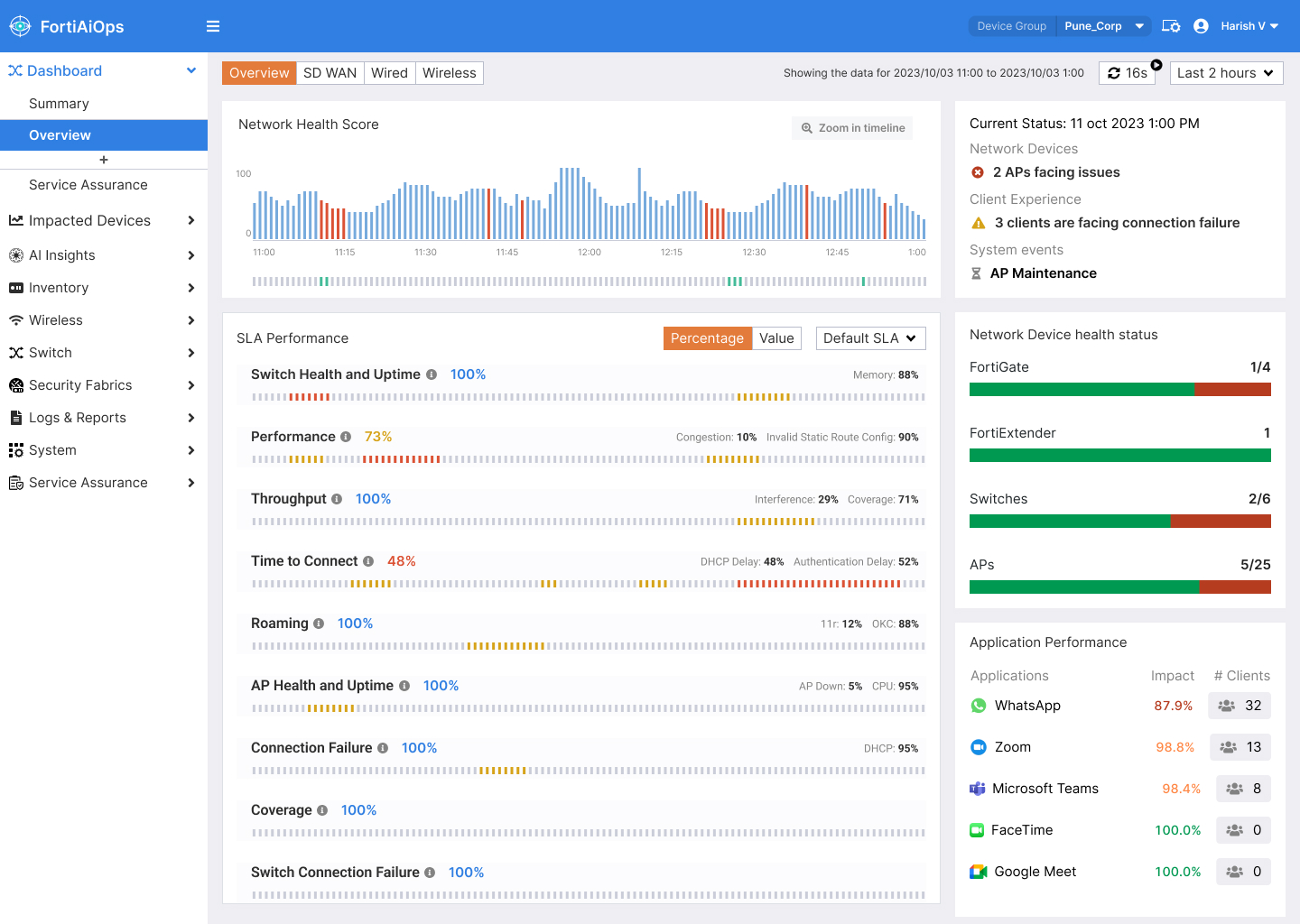
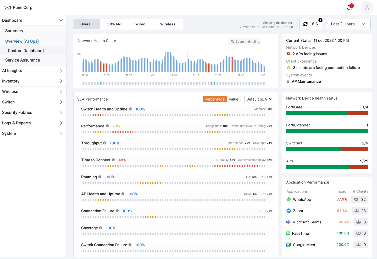
The new FortiAIOps Dashboard provides a consolidated, real-time view of overall network health and key performance metrics at a glance.
User Goals
- Quickly identify and resolve network issues by viewing real-time health scores, impacted SLAs, and root causes without navigating across multiple modules.
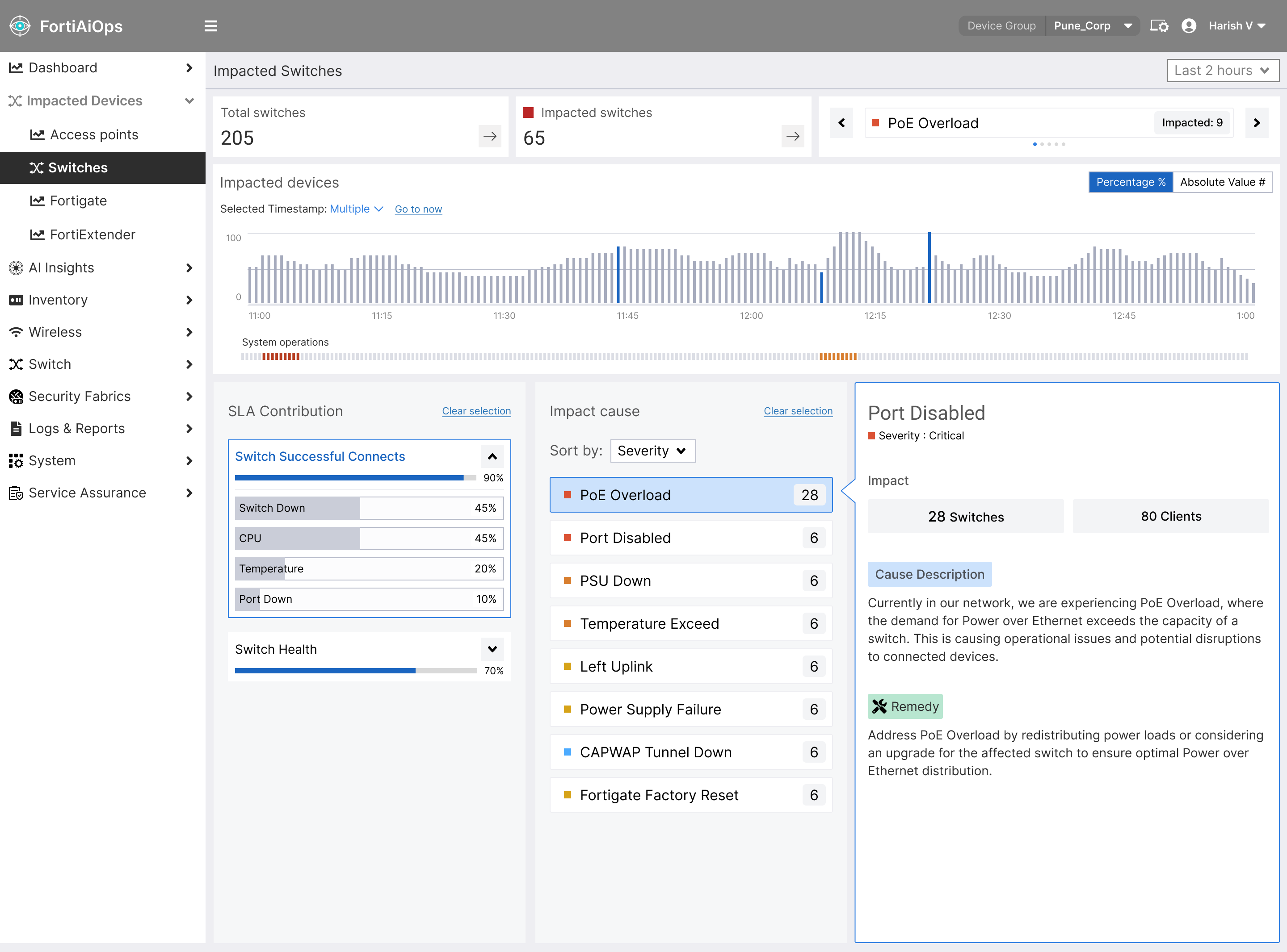
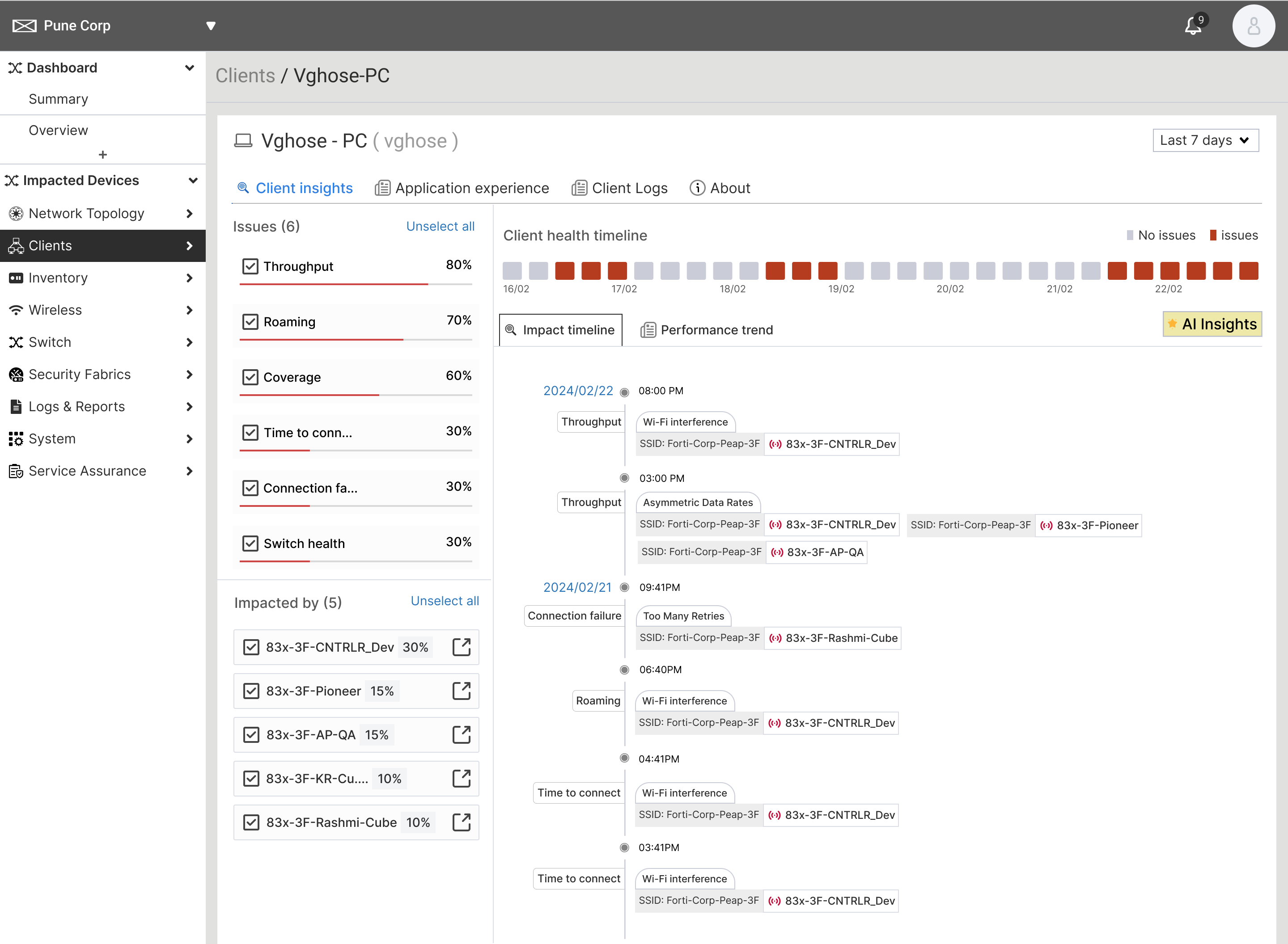
- Access client and device details effortlessly through global search and drill-down views, enabling faster troubleshooting with full context and recommended actions.
Problem Statement
The original FortiAIOps interface had a lot of useful information, but it was scattered across many screens. Network admins had to switch between different pages just to understand what was wrong, like whether a device was down or why a client was facing issues. This made troubleshooting slow and frustrating. Our goal was to bring everything together into one clear, easy-to-use view that helps users quickly see problems and take action.
Painpoints
- Too Many Alerts, Not Enough Clarity: The system showed lots of alerts, but it wasn’t clear which ones were urgent or what was causing them. Admins spent time guessing instead of fixing.
- Scattered Information: Important details were spread across different tools or pages. For example, device issues were in one place and client issues in another, making it hard to connect the dots.
- Troubleshooting Took Too Many Steps: Finding the cause of problems, like why a client had a slow connection, wasn’t smooth. Users had to search manually or use external tools to figure things out.
My role in the project
I was responsible for the end-to-end user experience, from research and ideation to interaction design and visual design. I also coordinated closely with stakeholders and developers throughout.
Design Goals and KPIs
To tackle these pain points, I defined clear design goals aligned with measurable outcomes. Our primary objectives and key performance indicators were:
- Unified Visibility: Create a one-stop dashboard for network health. KPI: Reduce the number of screens an admin must visit to assess overall status (target: from 4+ pages down to 1 page).
- Faster Troubleshooting: Streamline workflows to cut down the time it takes to identify and resolve issues. KPI: Reduce average time-to-troubleshoot by 30% (e.g., from ~15 minutes to ~10 minutes for common issues).
- Improved Task Success Rate: Make key actions (like finding an impacted device or client, or drilling into an SLA violation) more intuitive. KPI: Increase success rate in usability tests for core tasks to 90%+ on first attempt.
- Enhanced Data Clarity: Use visual hierarchy and graphics (charts, health scores, color-coding) to present complex data clearly. KPI: Improve user satisfaction scores (SUS) regarding information clarity by at least 20% in post-design surveys.
Design Ideation & Strategy Notes
To guide the redesign process with depth and direction, I compiled an extensive internal brainstorming document featuring:
Design Ideation & Strategy Notes >
Design Process
We approached the redesign with an iterative, user-centered design process, moving from rough concepts to polished solutions in stages. Key steps in our process included:
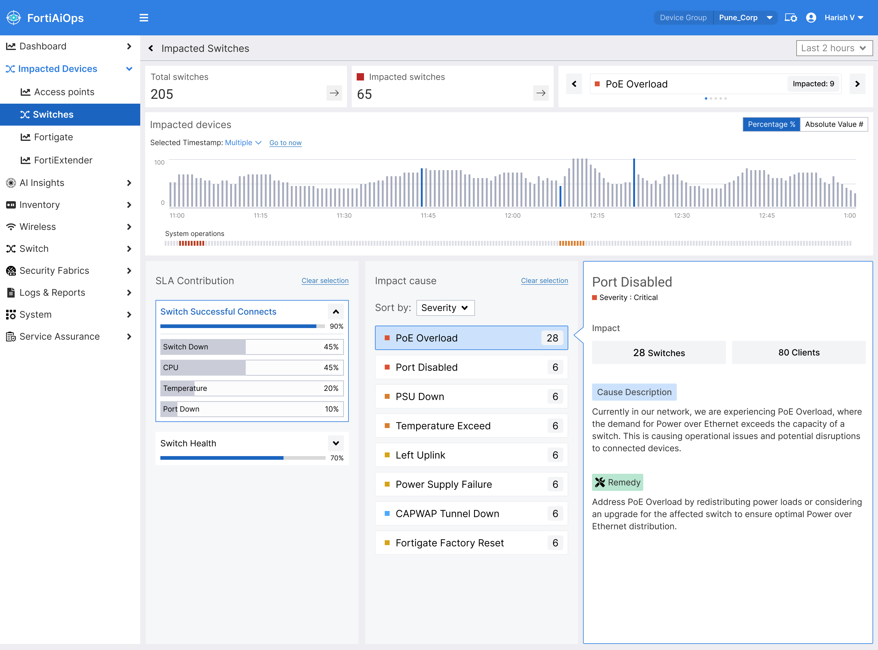
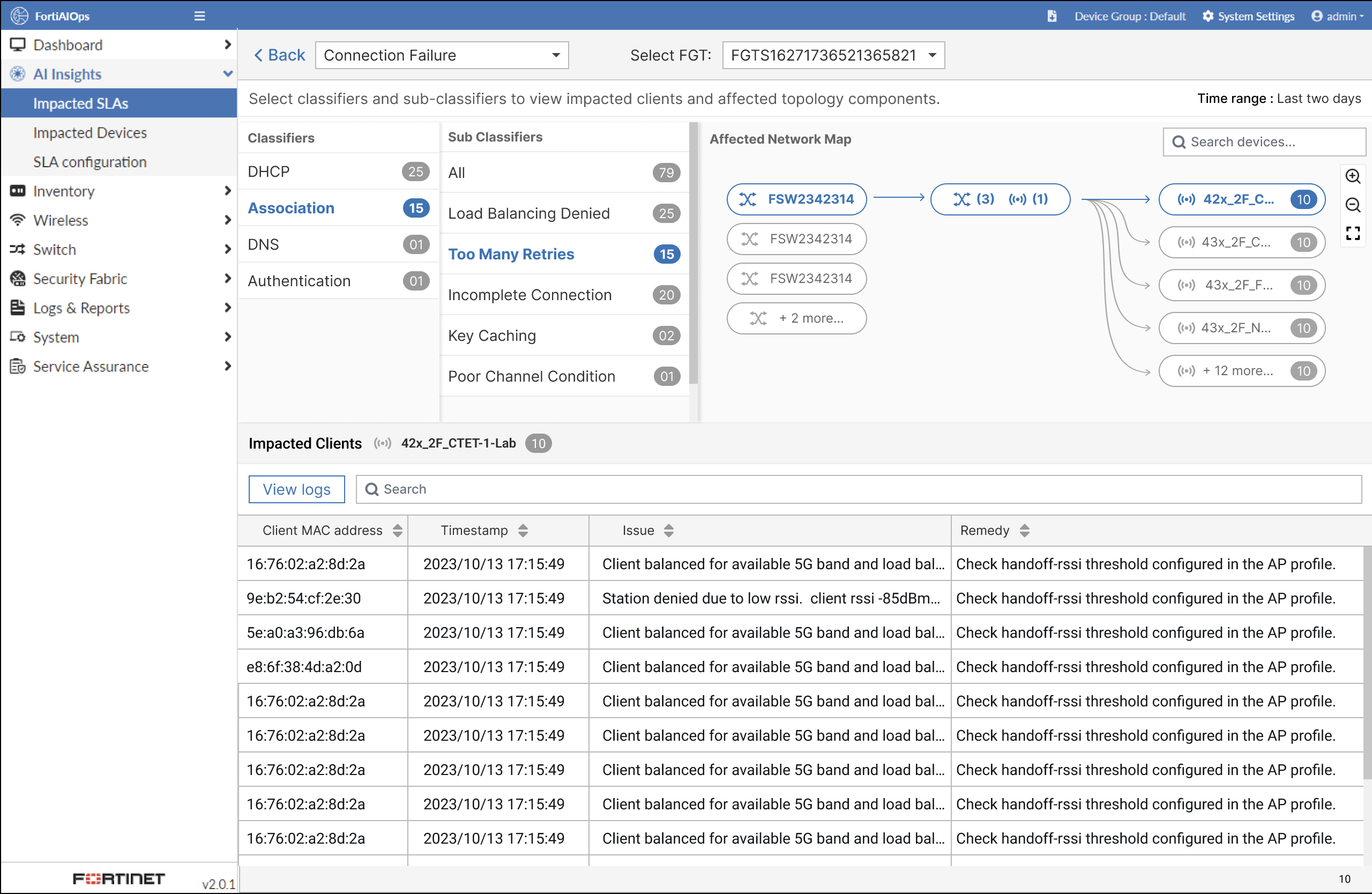
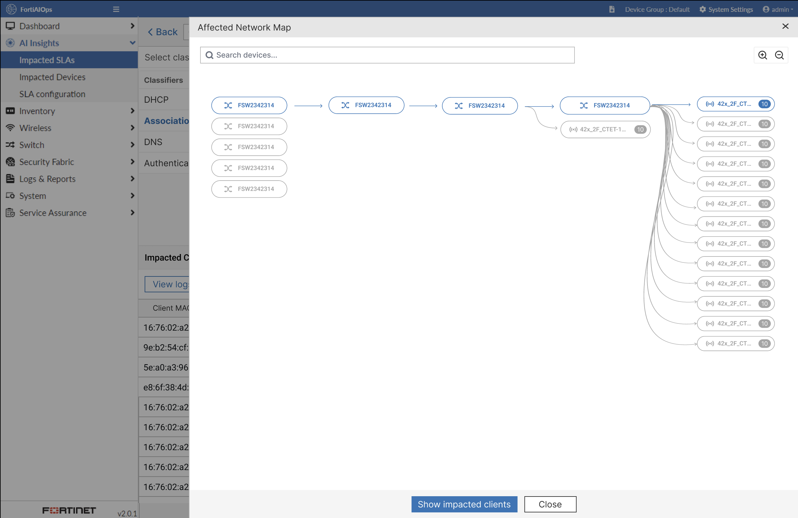
Ideation & Information Architecture: I began by mapping out a revised information architecture that would merge previously separate functions into a cohesive flow. This included drawing user journey maps for troubleshooting scenarios and identifying how the new navigation should be structured. We decided to center the experience around a unified “AI Insights” dashboard as the home for network monitoring, with drill-down paths for devices, clients, and specific SLAs. This groundwork ensured the subsequent designs had a logical foundation.
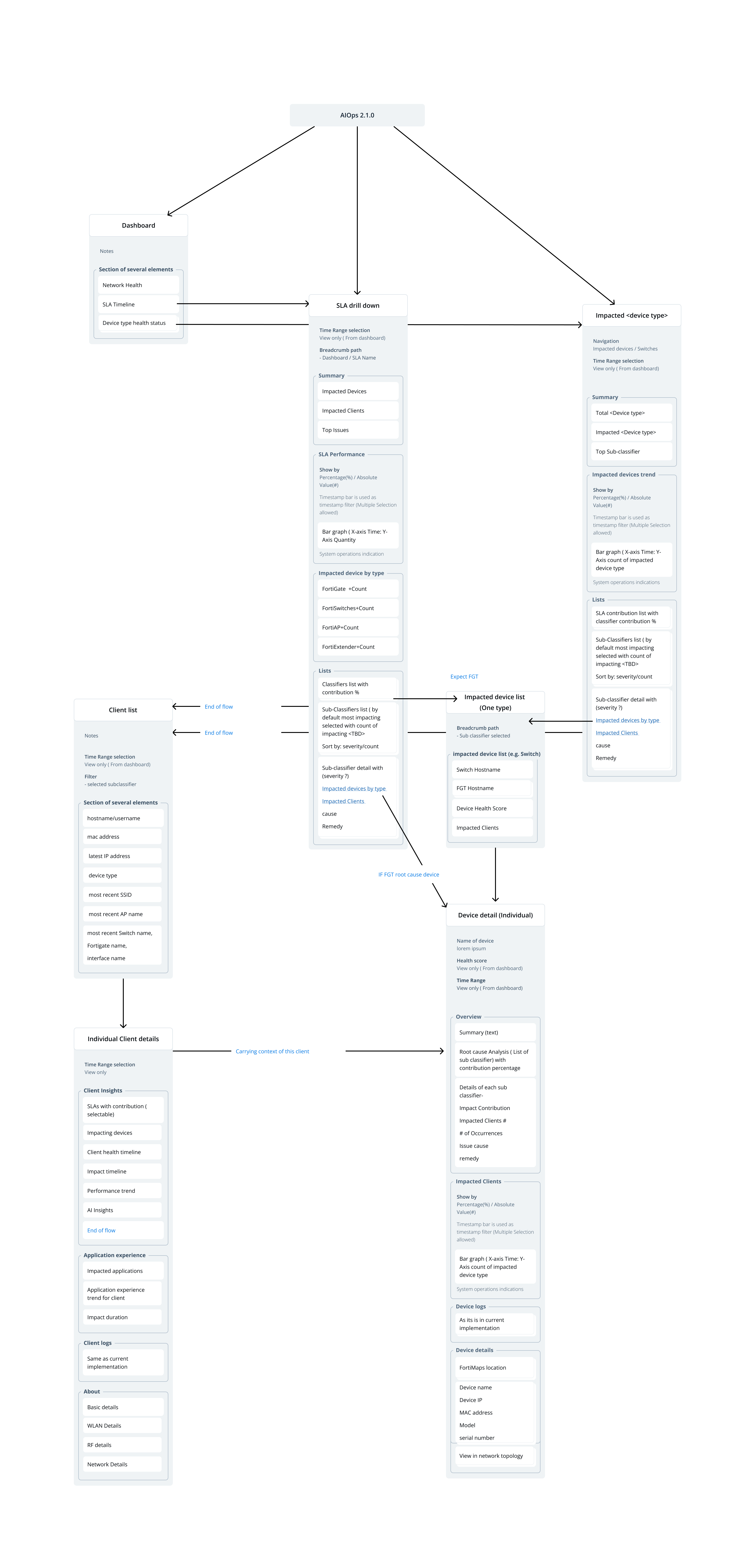
Lo-Fi Wireframes: Next, I sketched low-fidelity wireframes for critical screens and flows. These rough wireframes focused on layout and content hierarchy without visual distractions. For example, I created wireframes for the new Dashboard overview, an Impacted Devices list page, and a Client Detail page. We reviewed these with the team to validate that all necessary information and controls were accounted for and arranged intuitively before moving into detailed design.
High-Fidelity Mockups With consensus on the wireframes, I produced high-fidelity mockups using Fortinet’s UI style guidelines. I refined the design of charts, tables, and navigation elements to ensure a clean, modern look. Interactive prototypes were built for key user flows – such as investigating a drop in the “Switch Health” SLA – allowing stakeholders to click through the journey from the dashboard into an SLA drill-down and further into an individual device’s detail. These prototypes facilitated feedback on visual design and interaction nuances (like filter controls and hover tooltips) early on.