Project Overview
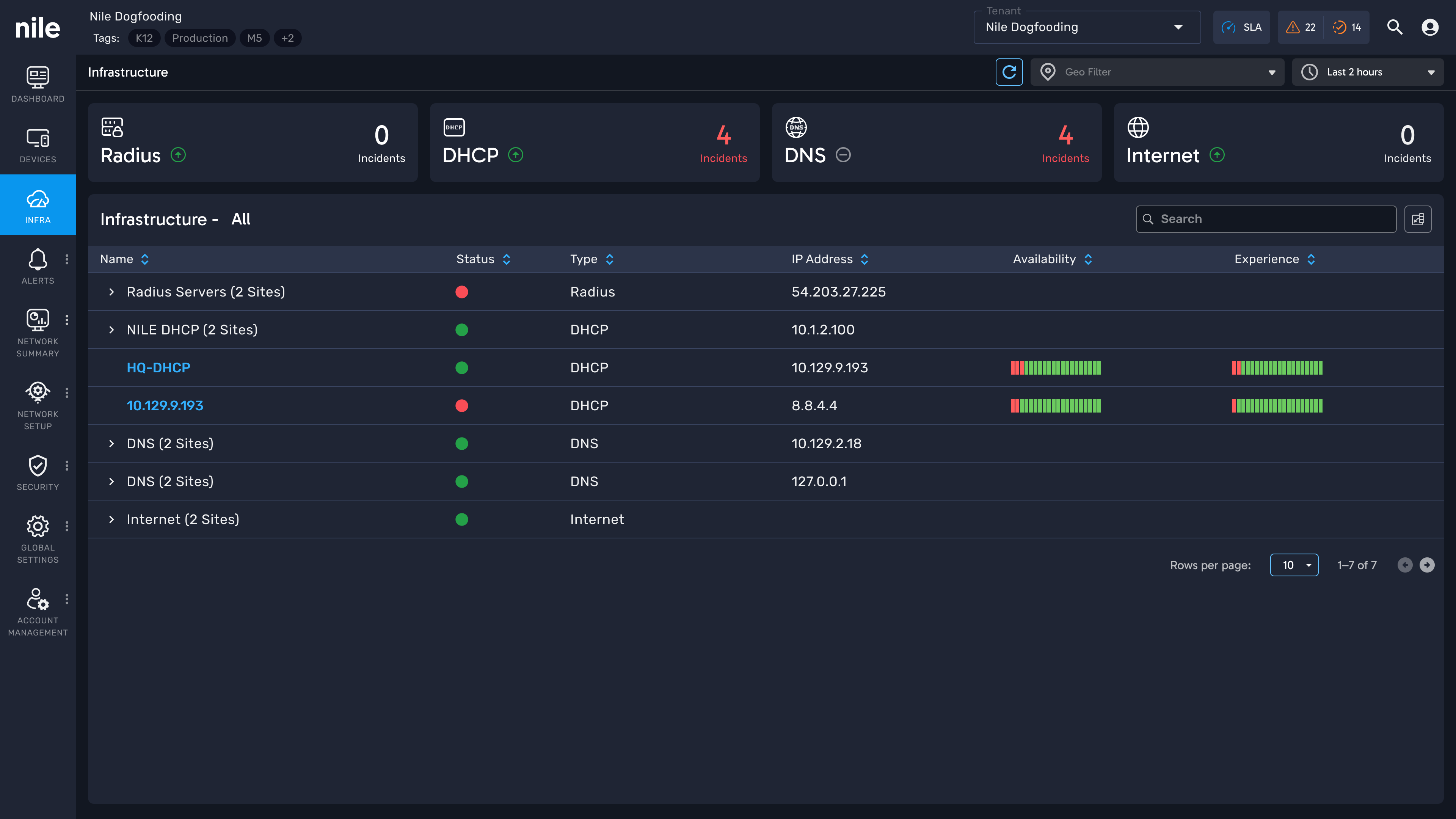
The Infrastructure page is the backbone of Nile Cleo, where admins and CSEs monitor RADIUS, DHCP, DNS, and Internet services across sites. The original design provided basic visibility but suffered from usability issues, inconsistent design patterns, and accessibility gaps. The redesign aimed to deliver a clear, consistent, and scalable monitoring experience, while aligning the product with Nile’s evolving design system.
Problem Statement
Network administrators lacked a clear, consistent way to distinguish between infrastructure availability issues and experience degradation. Inconsistent UI patterns, unclear visual hierarchy, and fragmented time-based data made it difficult to quickly interpret performance trends, identify incidents, and perform efficient triage—especially during critical troubleshooting windows.
Challenges
- How to simplify complex infra monitoring into a UI that is clear, consistent, and explainable?
- How to differentiate system states (availability, incidents, performance) without overwhelming users with too many signals?
- How to provide both high-level visibility and deep drill-down in the same workflow?
- How to redesign without breaking continuity for existing users while ensuring scalability for future Infra services?
Design Goals
The redesign set out to achieve the following:
- Create a consistent, accessible, and minimalist UI that supports admins in scanning system health quickly.
- Clearly separate incidents, availability, and performance in both list and detail views.
- Introduce intuitive duration controls for time-based data exploration.
- Build patterns that can be reused across other Nile modules through the design system.
My Role
- Led end-to-end redesign of the Infrastructure module.
- Conducted UI audits, stakeholder workshops, and CSE shadowing sessions to identify pain points.
- Designed navigation improvements, consistent visual language, and scalable chart interactions.
- Partnered with engineering for feasibility, worked closely with PMs for scope alignment, and integrated components into the design system.
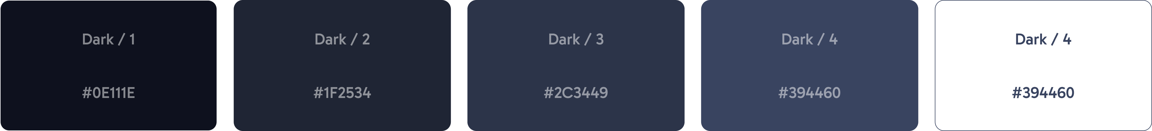
Retained legacy surface colors
We retained the core dark surfaces that form Nile’s foundation. These legacy colors were already familiar to users and provided a solid base for contrast and readability.
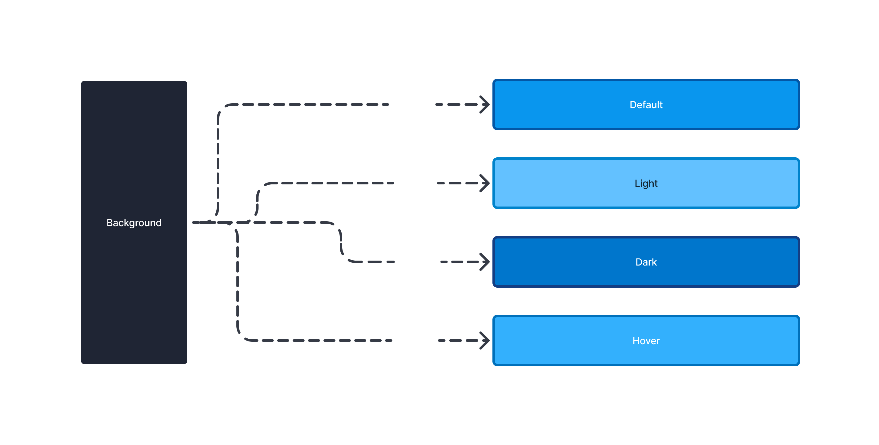
Primary Spectrum
The primary palette was expanded into a wider but simplified range (100–900). Each color in the spectrum was designed to balance brand identity, accessibility and usability.

Accessibility Contrast
Each surface-to-primary pairing was tested for WCAG 2.1 compliance, ensuring text and interactive elements meet minimum contrast ratios for readability. we created a predictable and accessible interaction model across all components.
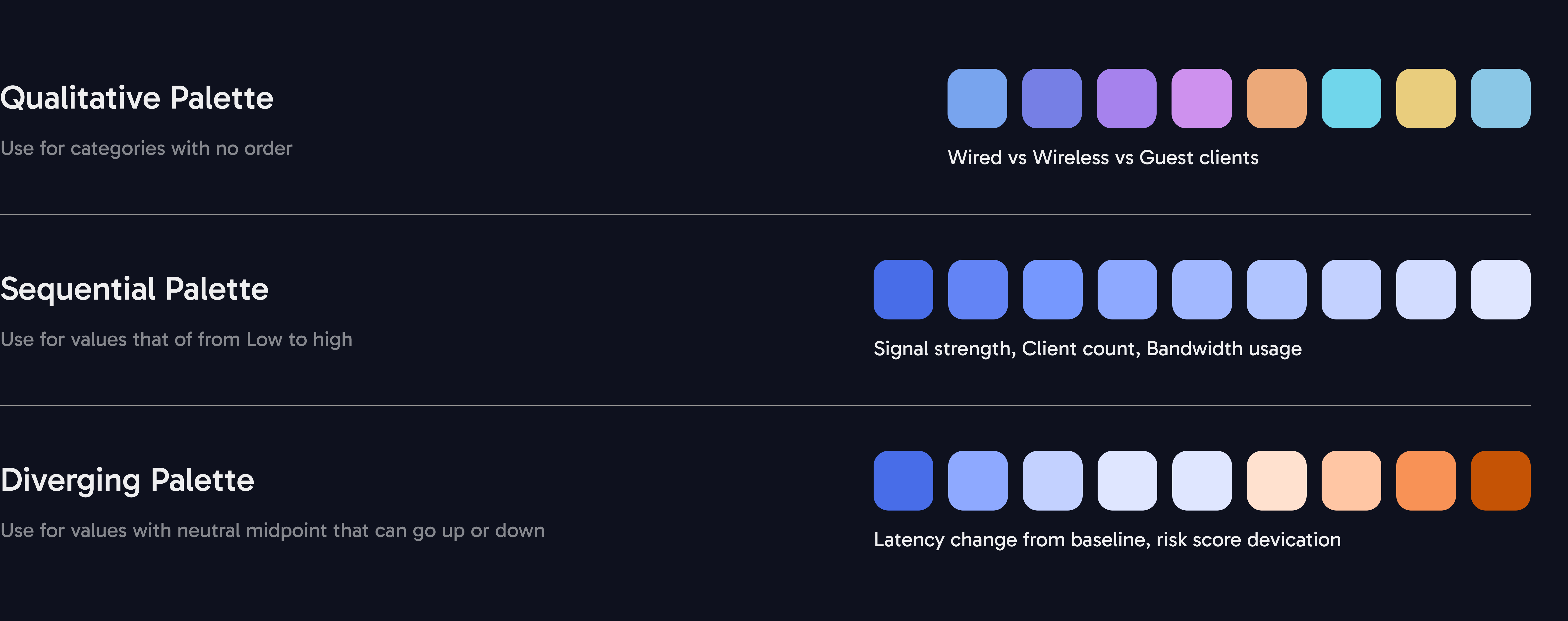
Color Palette System
A structured palette designed for clarity in data visualization, balancing brand identity with accessibility and functional use.
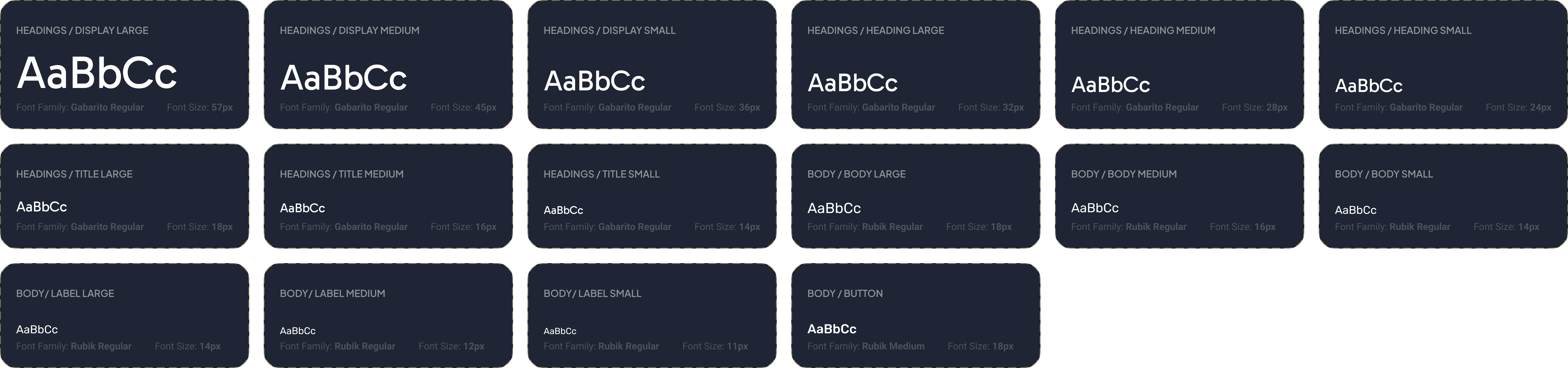
Typography System
A clear and scalable type hierarchy designed to balance readability and visual hierarchy across product surfaces.
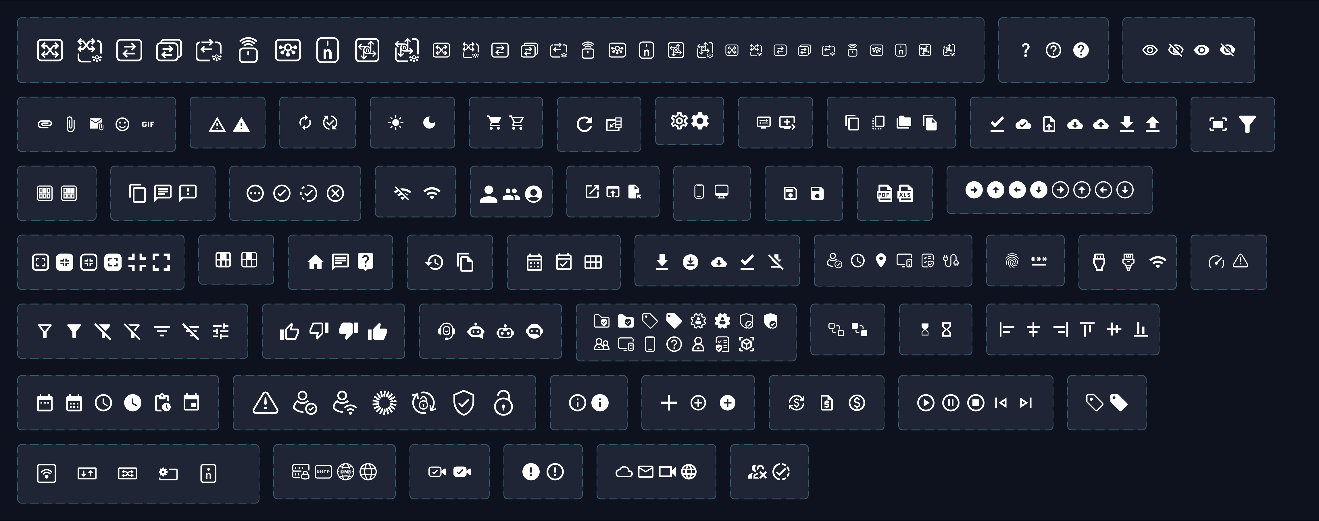
Iconography
Unified icons built on a consistent grid and stroke system, optimized for readability at all sizes and scalable across different product modules.
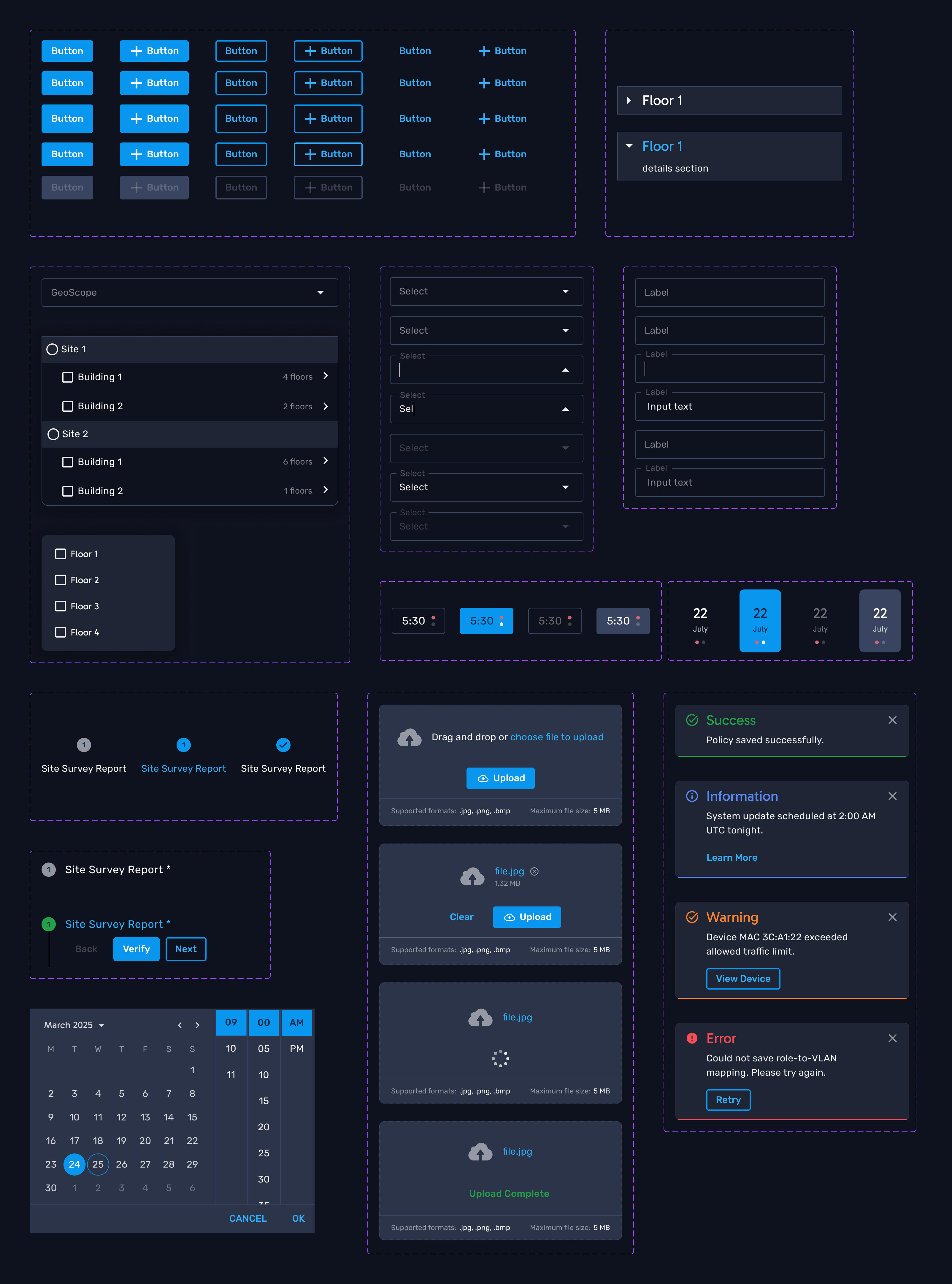
Components
A library of reusable, accessible, and scalable UI components built to maintain consistency across. Each component is designed to handle complex enterprise use cases while ensuring clarity, efficiency, and ease of use.
Key Outcomes of the Redesign
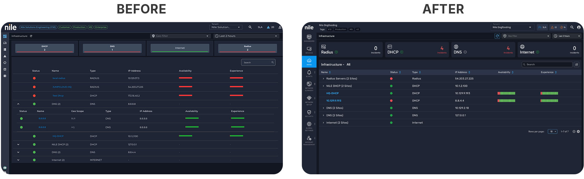
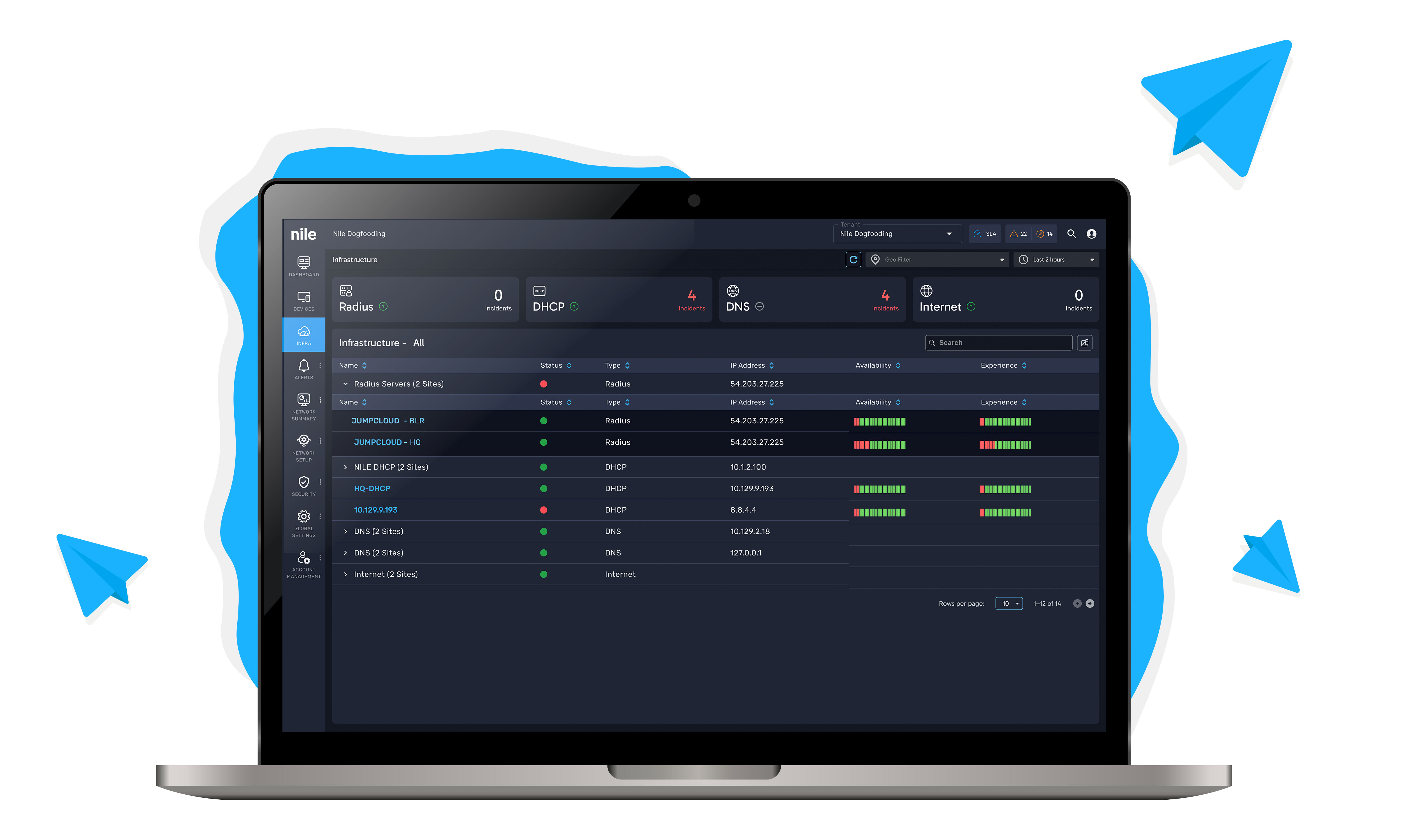
- Left nav with only icons → users had to hover, tooltips overlapped other items.
- Tenant name and tags looked alike, poor visual hierarchy.
- Incident counts and server status were shown on the same line → ambiguous interpretation.
- Colors lacked accessibility and consistency.
- Icons + labels in the left nav → discoverable, no hidden tooltips.
- Clear separation of tenant name vs. tags.
- Incidents and status indicators are segregated with distinct signals.
- Modular grouping of Infra services for future scalability.
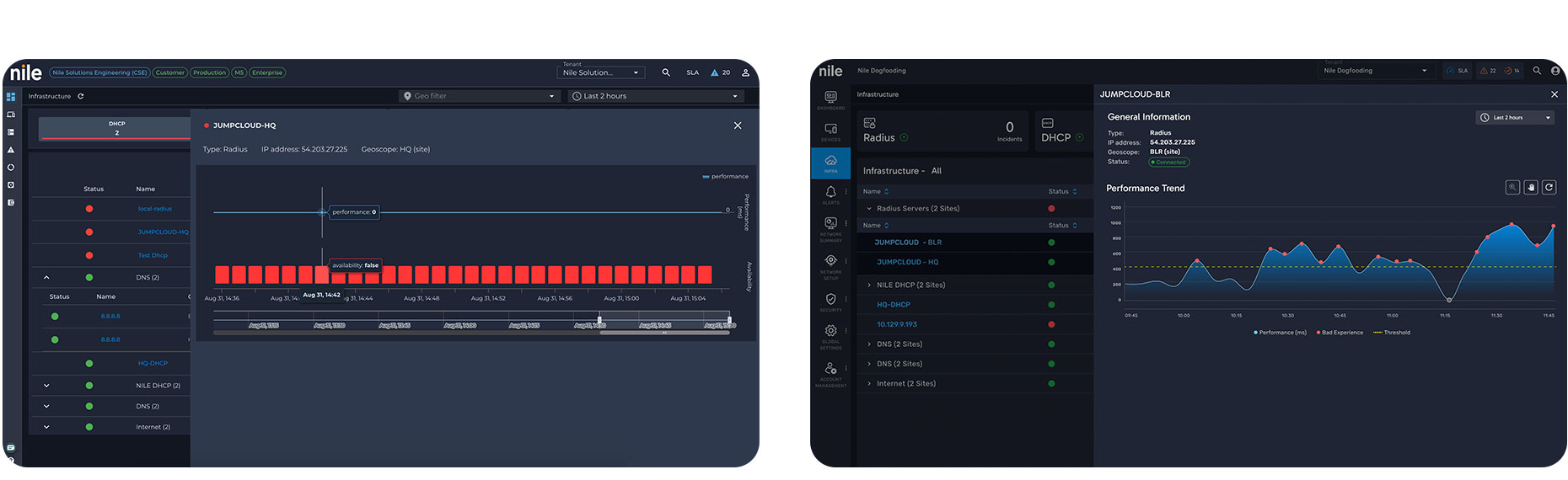
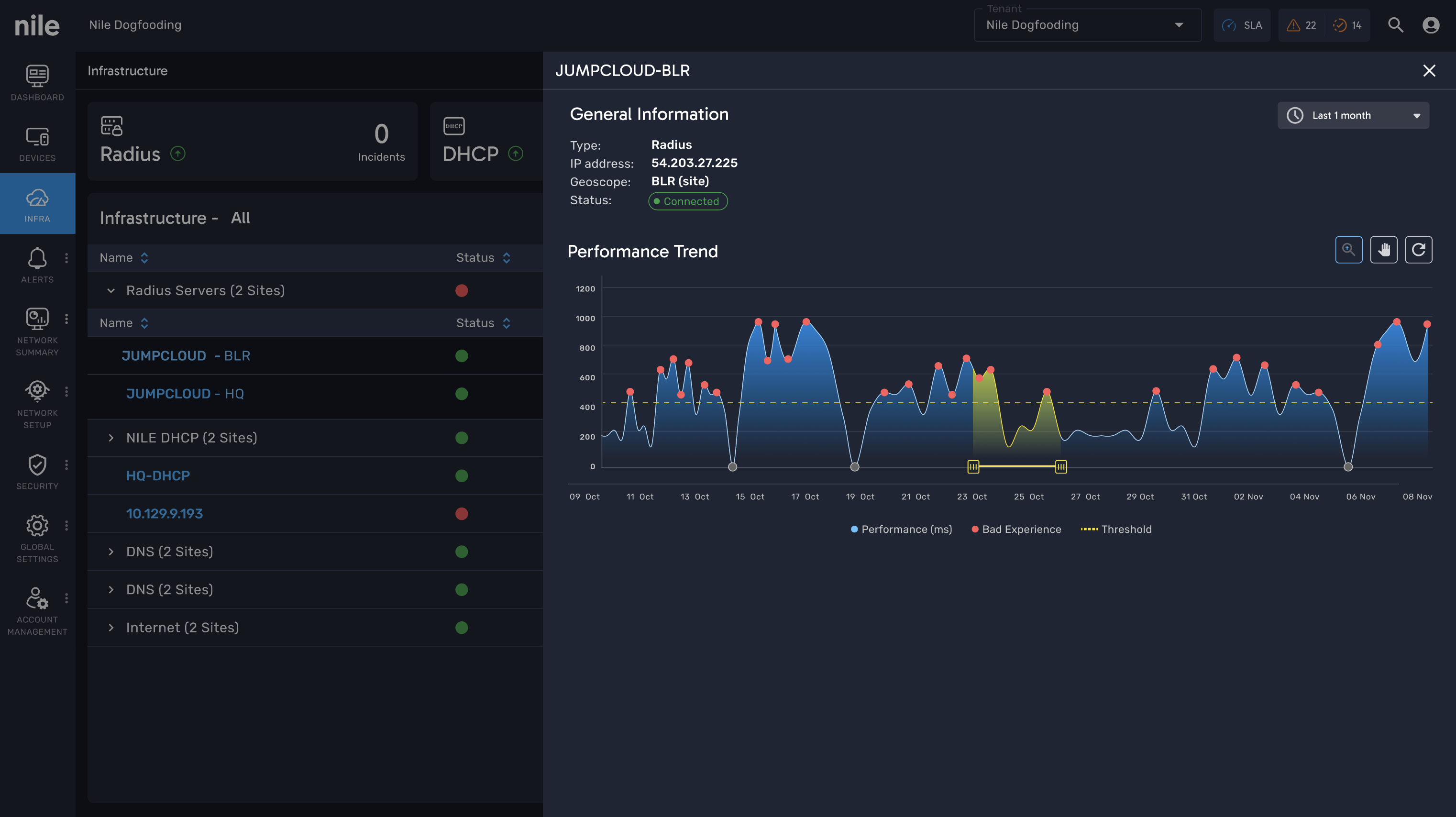
- Availability shown as binary red/green states.
- Incidents displayed as vertical red bars, disconnected from performance trends.
- Duration selection unclear: increasing the duration didn’t reflect the user’s selection properly.
- No integration of performance, availability, and incidents in one view.
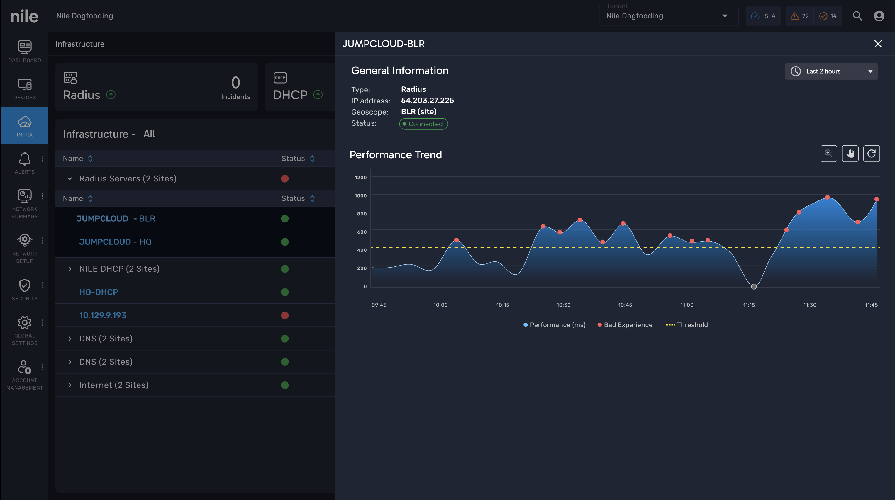
- Performance, availability, and incidents unified in a single chart.
- SLA threshold line + red “bad experience” markers provide context.
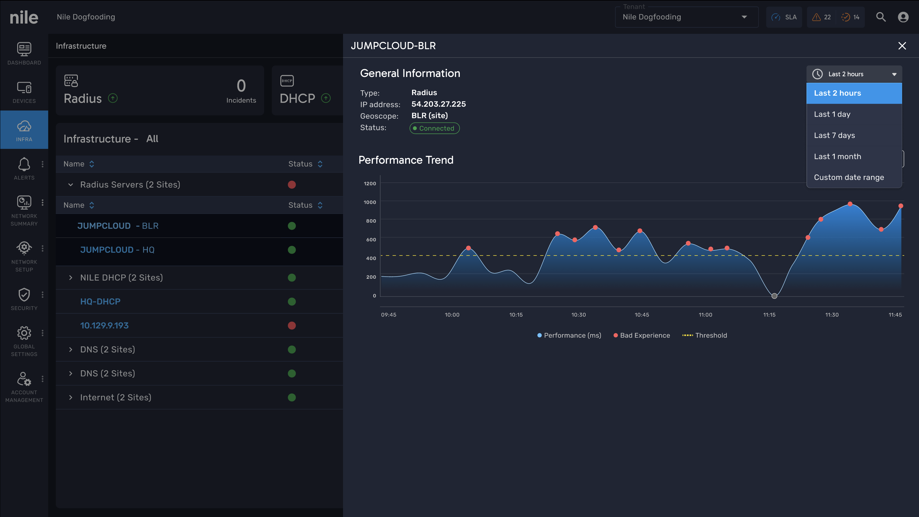
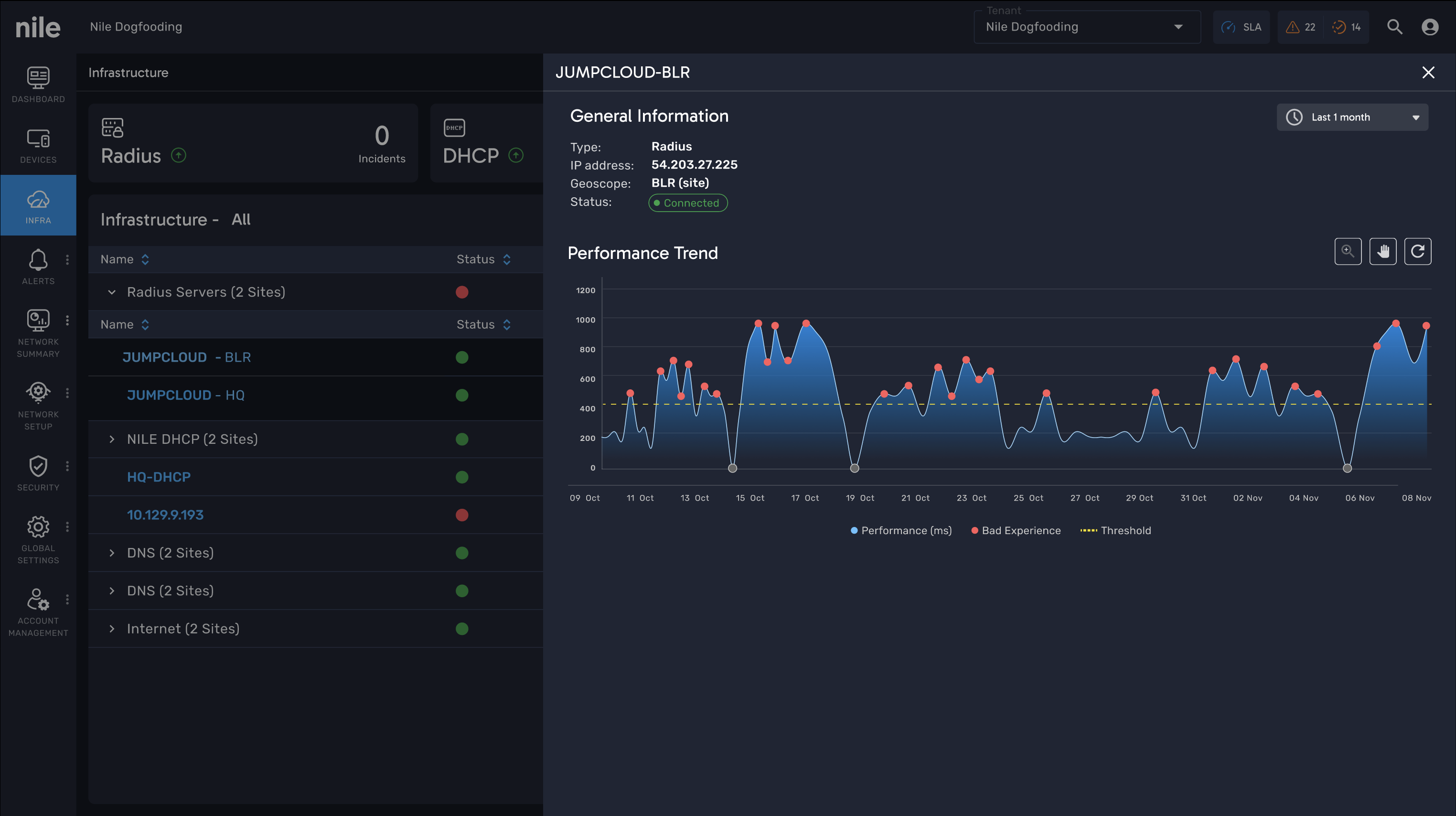
- Clear duration selection with presets (2h, 1d, 7d, 1m).
- Month view shows complete data, with hover auto-zoom into a specific day.
- Drag-to-zoom interaction allows users to explore custom ranges (e.g., 15 minutes).
- A balance between macro visibility (month) and micro analysis (minutes).
Hi-Fi Mockups
High-fidelity mockups were created to visualize the final experience with real data, interactions, and accessibility-ready design elements. These mockups reflect the refined color palette, typography system, and component library, ensuring pixel-perfect consistency across screens. They bridge the gap between design and development, serving as the blueprint for implementation and stakeholder validation.