Project Overview
FortiPresence is an enterprise platform that provides visitor analytics and captive portal management. Over time, its dashboards, floor analytics, area analytics, and heatmaps became cluttered, inconsistent, and difficult to interpret, reducing admin efficiency. The redesign aimed to deliver a modern experience that would simplify dashboards, streamline setup flows, and provide deeper, actionable insights for enterprise admins.
Challenges
Through stakeholder feedback and usability reviews, key challenges were identified:
- Dashboards cluttered with disconnected widgets and poor data hierarchy.
- Inconsistent data visualizations across Presence, Floor, and Area Analytics.
- Captive Portal setup overwhelming users with too many upfront options.
- Heatmaps static and lacking filters (e.g., dwell time, demographics, device types).
- Overall low usability for admins, leading to slower decision-making.
Design Goals
The redesign set out to achieve the following:
- Simplify dashboards with modular layouts and prioritized KPIs.
- Improve visualization consistency with standardized charts, colors, and labels.
- Streamline captive portal setup into a guided step-by-step flow with live previews.
- Enhance floor and area analytics with real-time drill-downs and clear hierarchy.
- Add interactivity to heatmaps with filters for demographics, devices, and dwell time.
- Boost admin efficiency and productivity through clarity and usability.
My Role
- Conducting stakeholder interviews and competitor analysis (Cisco DNA, Aruba Central).
- Identifying pain points across dashboards, portal setup, and analytics flows.
- Designing low-fi sketches, interactive widget library, and data visualization mappings.
- Creating high-fidelity prototypes in Figma with improved hierarchy and clarity.
- Leading usability testing sessions and iterating based on feedback.
- Delivering the final design package to engineering for implementation.
Double Diamond Process
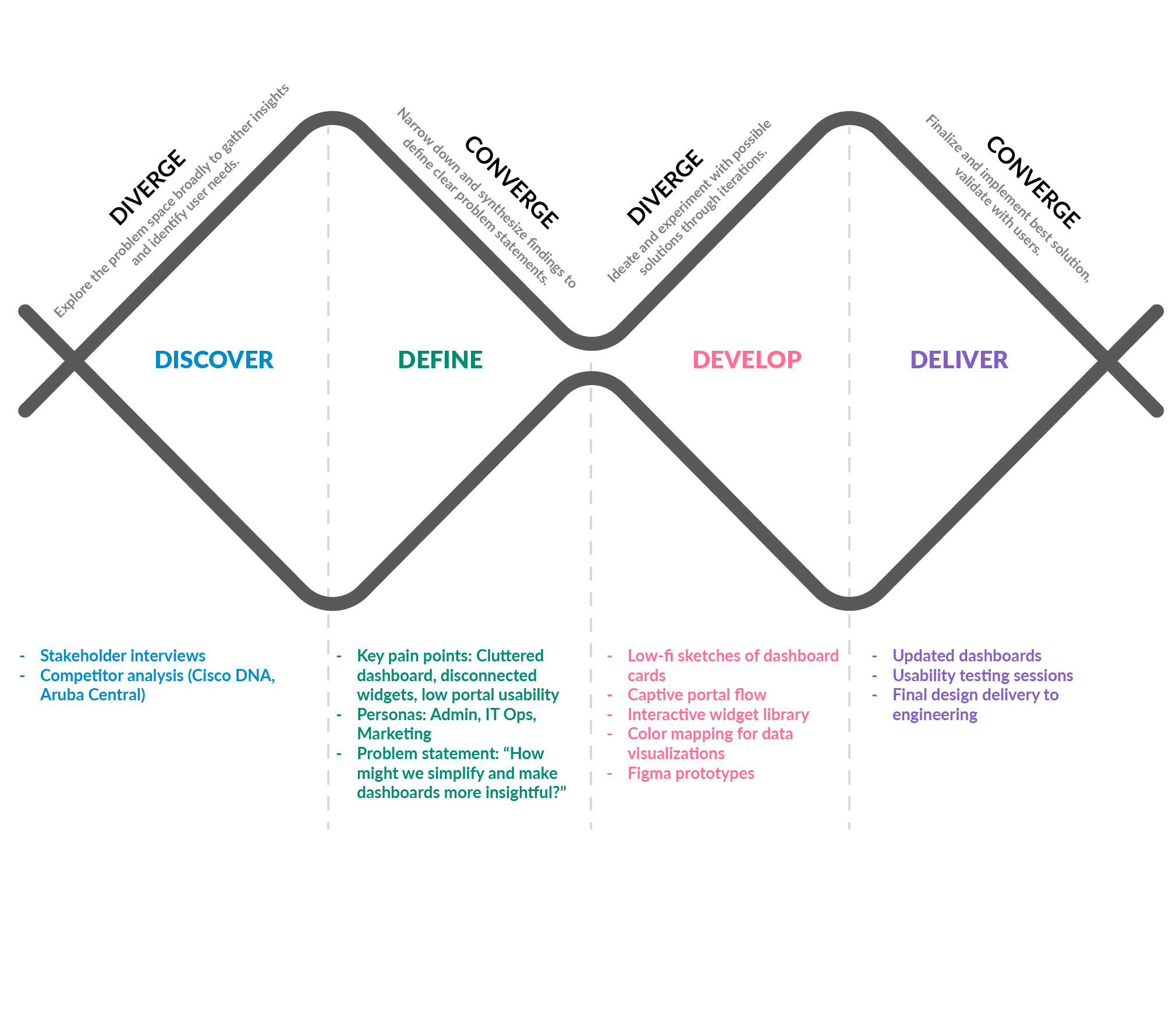
Discover
Stakeholder Analysis
- Stakeholders confirmed that the dashboards were overwhelming, showing too much data at once without prioritization. Users struggled to focus on what mattered.
- Non-IT users, especially from marketing teams, found the portal creation process rigid and confusing—requiring support even for basic branding tasks.
- Many users were unaware they could create custom dashboards or edit layouts, limiting their ability to adapt the tool to their needs.
- Customer Success flagged recurring tickets for tasks like logo uploads, color changes, and missing preview options—indicating poor onboarding UX.
- Product and network stakeholders emphasized reducing time-to-value by simplifying layout, adding role-based filters, and supporting step-based workflows.
Competitor Analysis
A detailed evaluation of leading location analytics platforms like Cisco Spaces and Aruba Central to understand their strengths, limitations, and design patterns. This helped identify usability gaps and innovation opportunities in visitor tracking, dashboard customization, and captive portal flexibility.
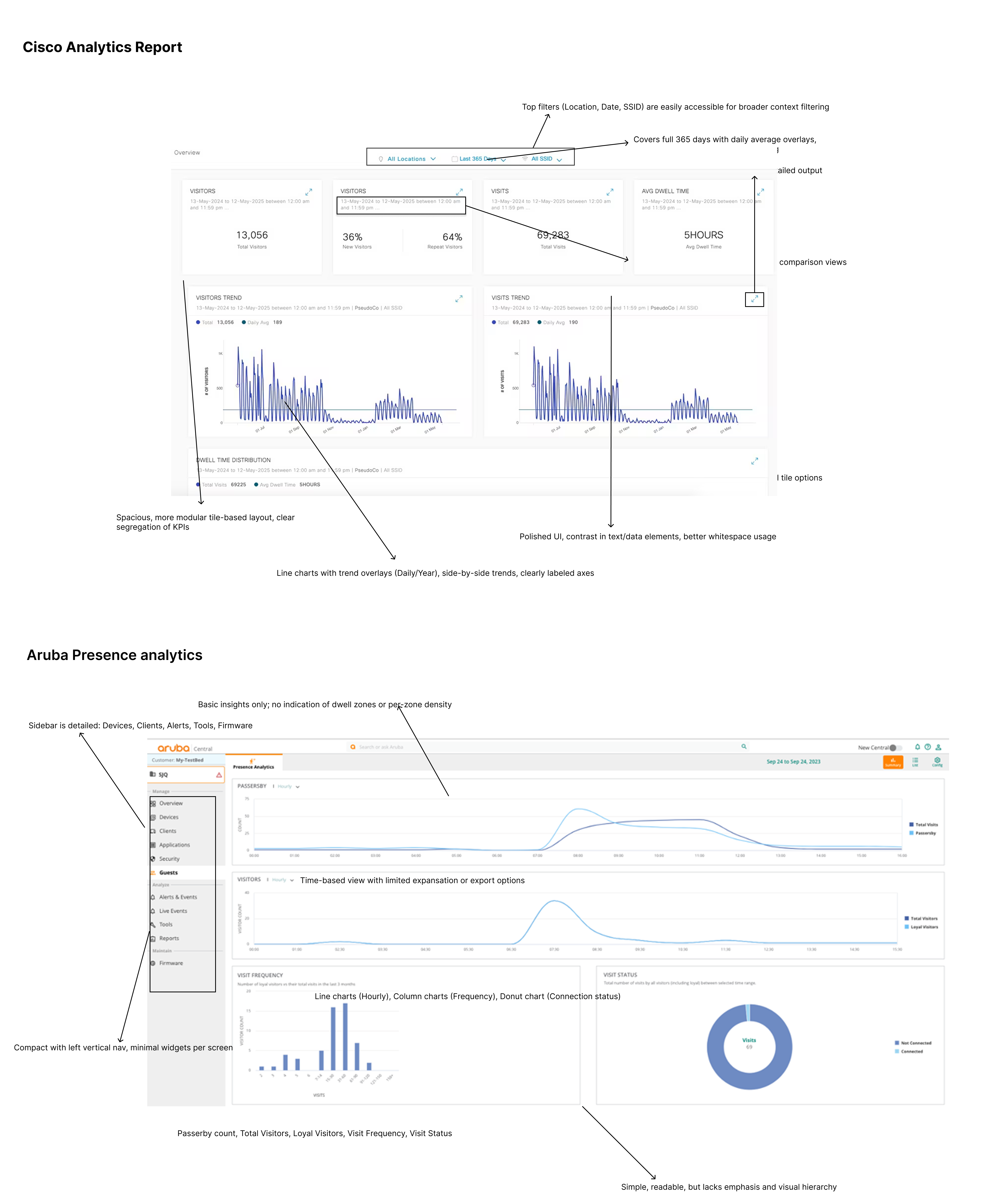
Key insights were distilled from the competitive research, highlighting the usability strengths of Aruba’s clean UI and Cisco’s deep analytics. Despite their capabilities, both platforms lacked role-specific customization and ease-of-use, especially for non-technical teams.
- Aruba Central excels in real-time visibility with clean, minimal dashboards showing connection status, visit frequency, and loyal visitor insights. However, it lacks advanced engagement features or deep behavioral analytics.
- Cisco Spaces offers rich historical analytics, including detailed dwell time, visitor trends, and repeat visitor rates. Its interface supports longer time ranges and comparative views but can be visually dense and overwhelming for new users.
- Aruba’s portal and analytics tools are simple but rigid, offering limited customization and templates primarily aimed at IT users.
- Cisco includes a wider range of engagement and automation features, such as visitor persona tagging and campaign triggers, but requires greater technical knowledge to configure effectively.
- Both platforms show limitations in user onboarding and layout flexibility, especially for cross-functional teams like marketing or guest services that rely on intuitive flows and branded experiences.
Define
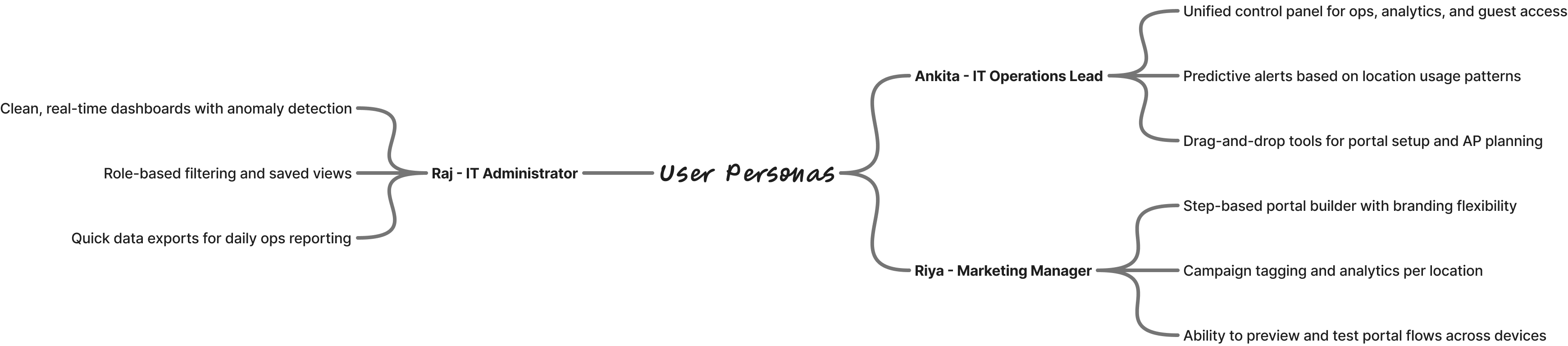
Proto Persona
We developed proto-personas based on interviews and stakeholder inputs to represent our primary user types—Network Admins, IT Operations Leads, and Marketing Managers. Each had distinct goals, pain points, and needs that directly influenced our design priorities.
HMW Statements
Based on user research and business goals, we framed a set of “How Might We” questions to guide ideation and align the team around solving the right problems. These questions addressed dashboard clarity, role-based workflows, and simplified portal setup.
- How might we simplify dashboards so Admins can quickly identify issues without being overwhelmed by excessive data?
- How might we enable IT Ops teams to configure and monitor networks more efficiently using a unified, role-aware control panel?
- How might we reduce technical dependency for marketing teams when customizing and launching guest Wi-Fi portals?
- How might we improve mobile accessibility for on-the-go users who need real-time visibility across multiple locations?
- How might we allow users from different departments to personalize dashboards and workflows without compromising data accuracy or security?
Develop
Every screen and UX flow was designed with a clear intention—to address the HMW challenges. From modular dashboards to a step-based portal builder, we introduced scalable, intuitive solutions that empower both technical and non-technical users across departments.
HMW simplify dashboards so Admins can quickly identify issues without being overwhelmed by excessive data?
- Solution
- Introduced modular widget-based dashboards with the ability to choose only relevant KPIs (e.g., New vs Repeat Visitors, Device Type).
- Used progressive disclosure — summaries shown upfront with deeper insights accessible via drill-down.
- Designed clean visual hierarchy with consistent chart types and contextual legends (e.g., color-coded donut charts for connection status).
HMW enable IT Ops teams to configure and monitor networks more efficiently using a unified, role-aware control panel?
- Solution
- Integrated location-aware filtering by building, floor, and area to reduce manual toggling.
- Added a widget library with customizable options for different Ops scenarios (e.g., 15-min live data, device density, heatmaps).
- Provided a custom dashboard builder, allowing IT Ops to create role-specific views for operational monitoring.
HMW reduce technical dependency for marketing teams when customizing and launching guest Wi-Fi portals?
- Solution
- Designed a step-by-step captive portal builder with real-time previews (mobile + desktop).
- Enabled easy branding updates: upload logo, apply theme color, and drag-drop background images without coding.
- Simplified login method configuration with toggle-based options for social, email, or self-registration.
HMW improve mobile accessibility for on-the-go users who need real-time visibility across multiple locations?
- Solution
- Implemented responsive dashboard layouts that adapt cleanly across screen sizes.
- Prioritized key metrics like live user count, connection status, and alert triggers on the default landing view.
- Enabled location dropdown filters to quickly switch between sites on mobile.
HMW allow users from different departments to personalize dashboards and workflows without compromising data accuracy or security?
- Solution
- Introduced user-role based dashboard creation: each user can create and save personalized dashboards (e.g., Ops vs Marketing).
- Ensured data access is governed by roles (Admins vs Viewers) without affecting data integrity.
- Made widget configurations intuitive, with drag-and-drop and “Save View” options for team-specific reporting.
Wireframes
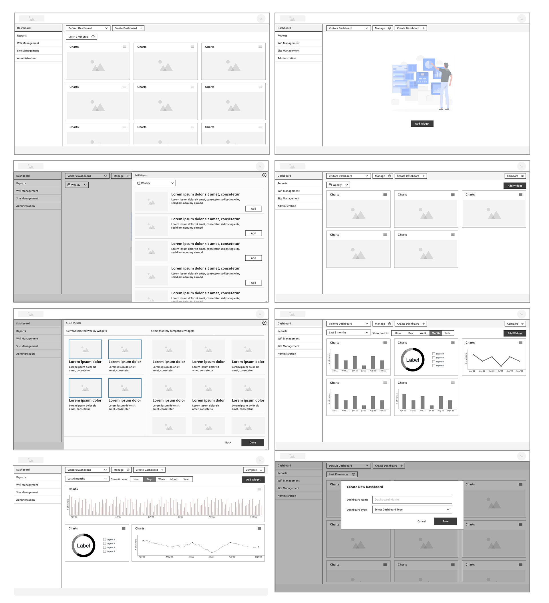
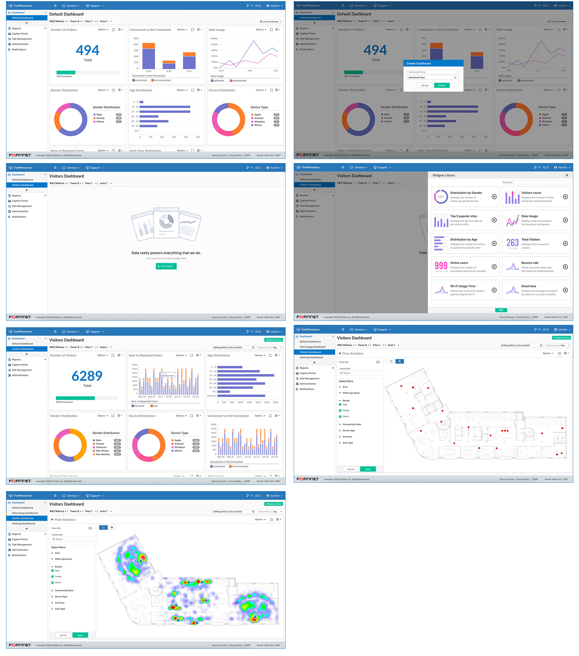
Dashboard & Widget Management
A modular dashboard experience with customizable widgets, drag-and-drop layout, and support for multiple saved views.Users can build, manage, and personalize dashboards using a visual widget library and flexible filters.
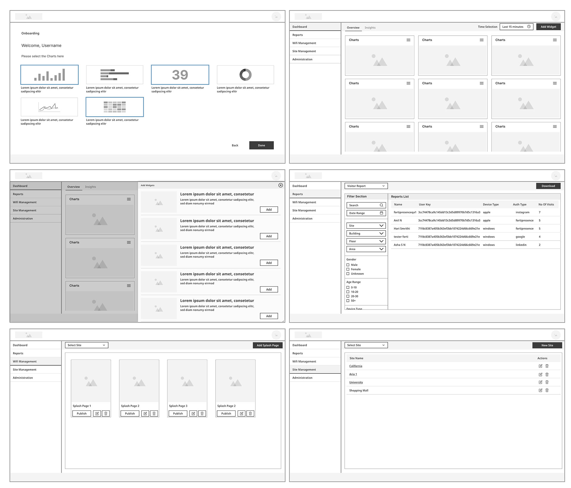
Reports, Onboarding, & Splash Page Setup
End-to-end flows covering onboarding setup, visitor reports, and captive portal (splash page) publishing. Designed for both IT and marketing users to filter insights, manage visitor data, and control brand experiences with ease.
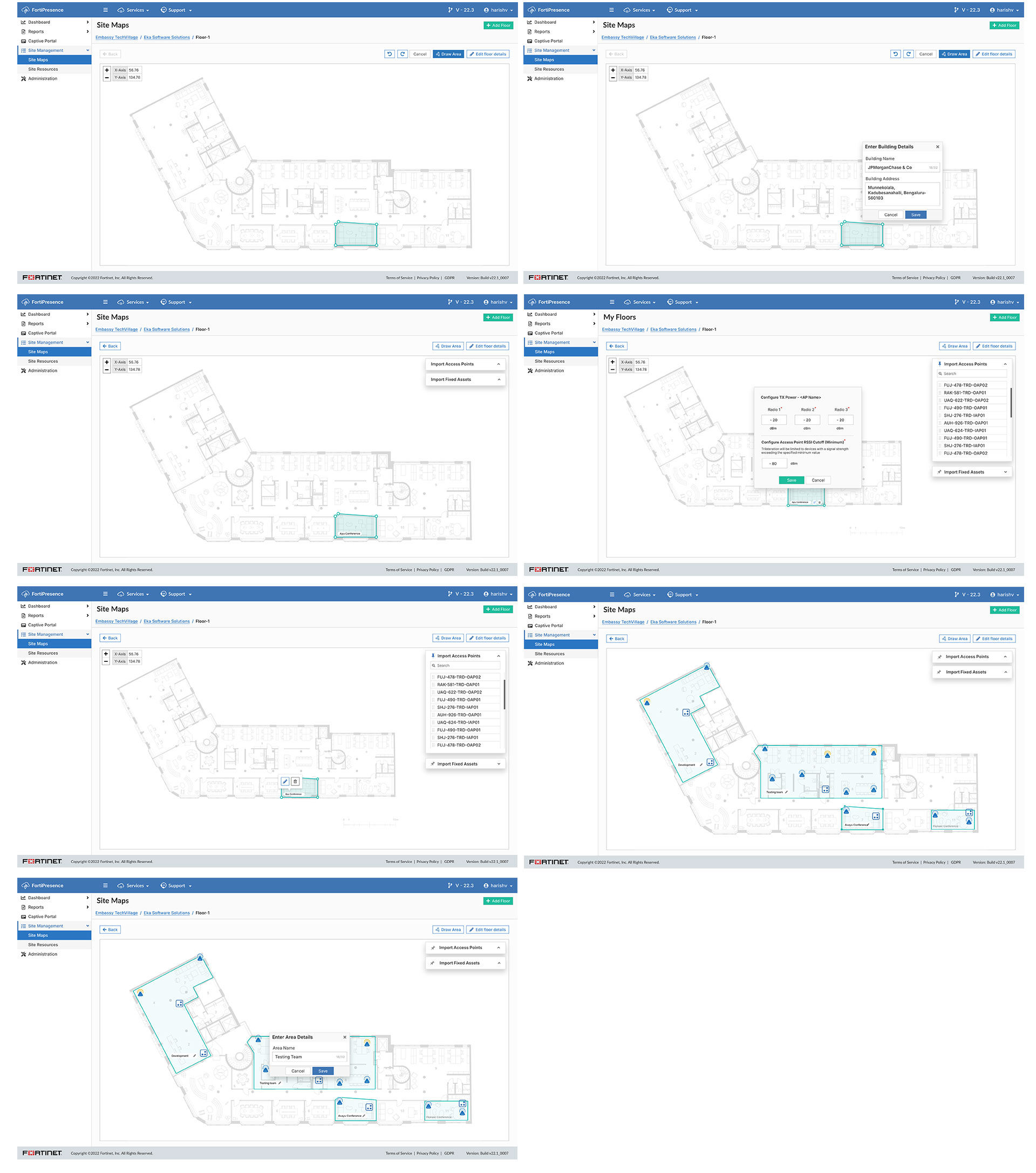
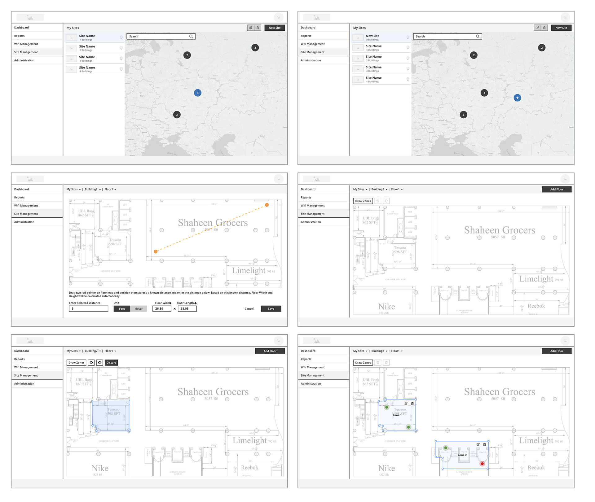
Site Map & Zone Management
A scalable site management system with map-based building and floor selection for physical spaces. Users can define zones, measure distances, and create analytics-ready floor plans for heatmaps and footfall tracking.
Key Outcomes of the Redesign
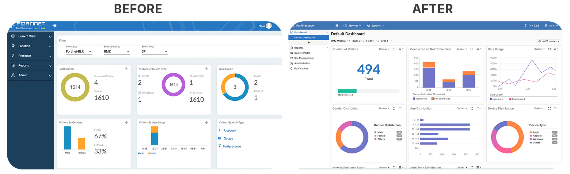
- Clarity & Readability ↑40% Clean typography, consistent colors, and improved spacing make data easier to scan at a glance.
- Information Hierarchy ↑35% Key KPIs (visitors, connected vs. not connected, traffic usage) are now front and center, reducing time to insights.
- Rich & Interactive Visuals ↑45% Expanded chart types (line, bar, pie) with drill-downs and filters give admins deeper, actionable insights.
- Consistency & Efficiency ↑30% Unified interaction patterns (options menus, export, time filters) simplify learning and reduce navigation effort.
- Decision-Making Productivity ↑25% Real-time graphs + demographic breakdowns (age, gender, device, auth type) empower faster, data-driven decisions.
Hi-Fi Mockups
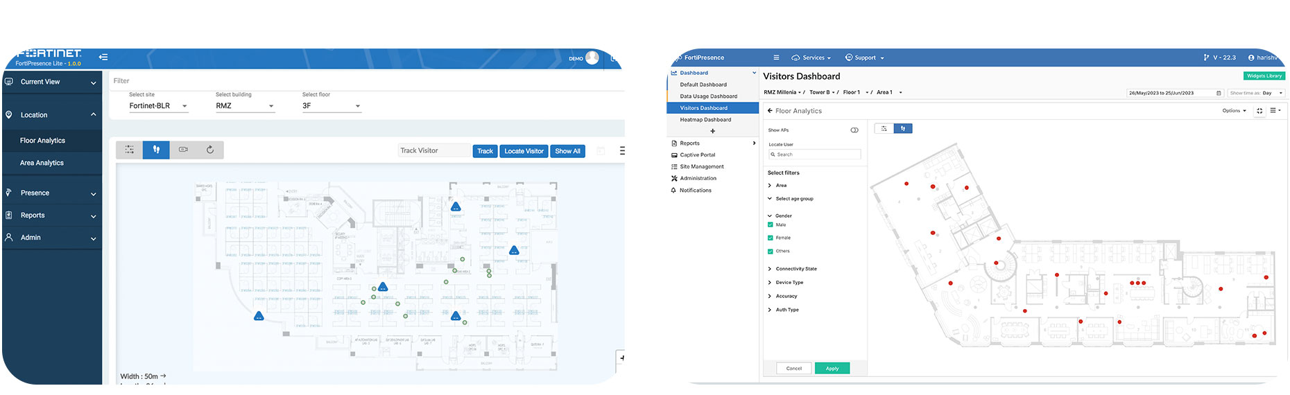
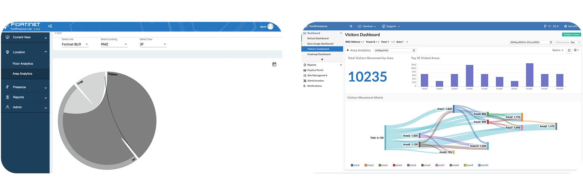
The Hi-Fi designs deliver a comprehensive location analytics platform, enabling easy portal creation, real-time visitor insights, and precise site-zone mapping. Together, they empower IT and marketing teams to enhance on-site experiences and operational visibility.
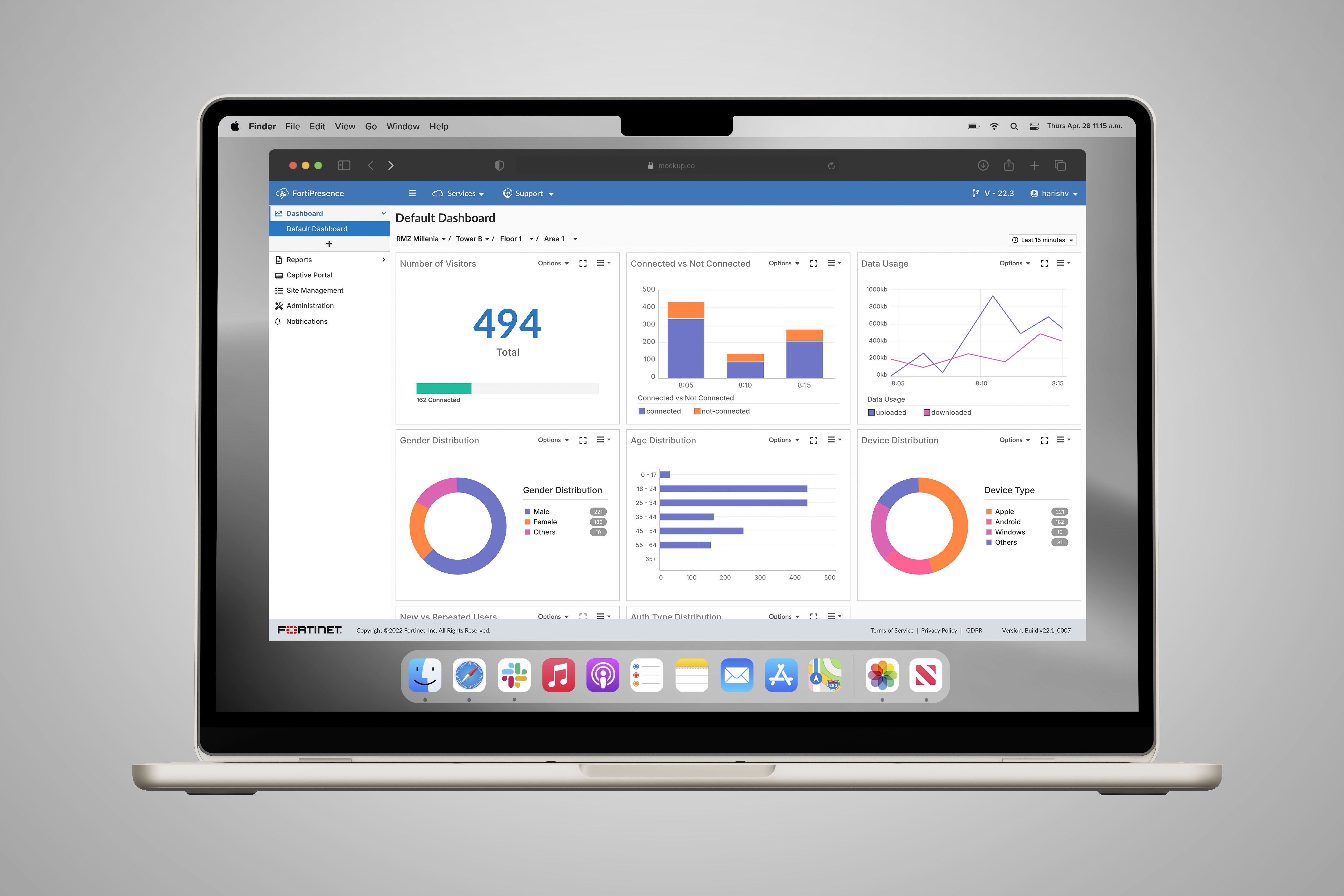
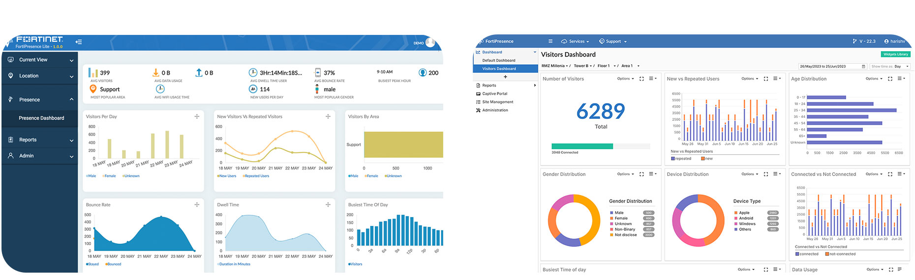
Network Visibility
This visual set demonstrates the end-to-end dashboard experience in FortiPresence, showcasing how IT and business users monitor real-time visitor data, customize dashboards, and visualize location heatmaps. The journey blends insight discovery with physical presence mapping.
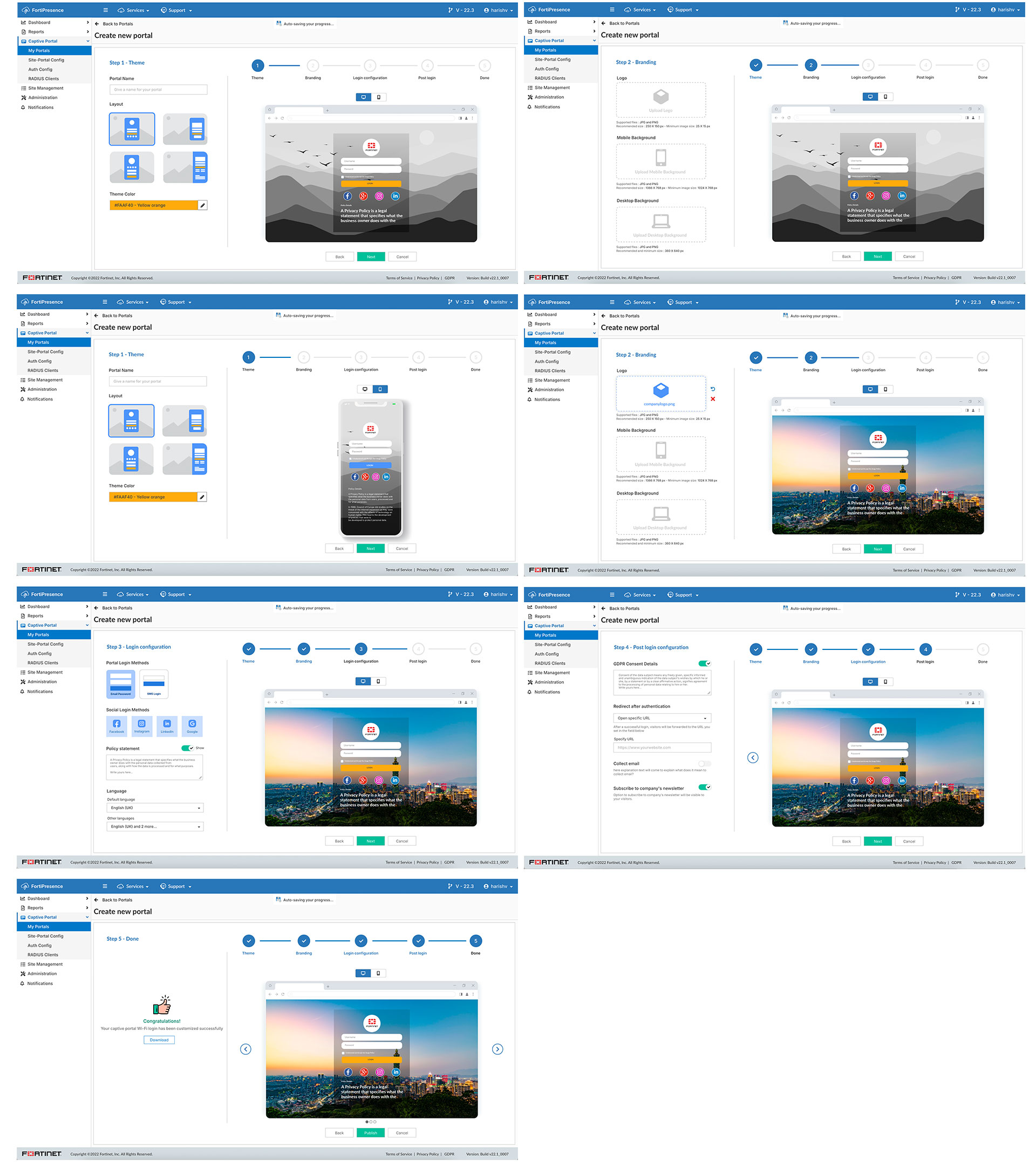
Captive Portal Step Flow
The captive portal creation in FortiPresence follows a guided 5-step process aimed at helping network or marketing admins build branded login pages for guest Wi-Fi access. The flow ensures both branding flexibility and network compliance, while simplifying what used to be a rigid, template-only setup.
Site Map Setup Flow
The Site Map flow helps IT admins visually configure physical spaces (buildings, floors, and areas) so they can later overlay visitor heatmaps, device positions, and movement patterns for real-time insights.