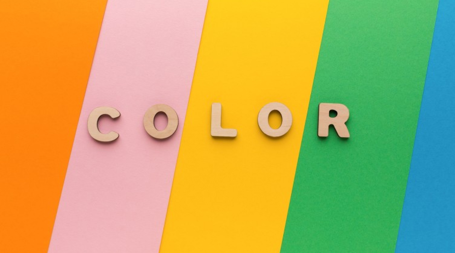
Color theory is a powerful tool for designers to create emotional connections and tell stories through design. It's important to understand how colors interact with each other and the human eye to create a harmonious and effective design.

Are you ready to dive into the fascinating world of color theory? Let me tell you a story about how it can make or break a design.
Meet Sarah, a young graphic designer who just landed her dream job at a branding agency. She's excited to start working on her first big project, creating a new visual identity for a local coffee shop. But as she starts brainstorming ideas, she realizes she's not quite sure how to choose the right colors for the brand.
That's where color theory comes in. At its most basic level, color theory is the study of how colors interact with each other and with the human eye. Think of it like a recipe book for designers - it gives you the ingredients and techniques you need to create a harmonious and effective design.
For example, did you know that complementary colors (like blue and orange) create a strong contrast that can be eye-catching and attention-grabbing? Or that analogous colors (like blue, green, and purple) create a sense of harmony and unity?
But back to Sarah's dilemma. She knows that the coffee shop's brand needs to convey a sense of warmth and coziness, but she's not sure which colors will achieve that. After some research and experimentation, she decides to use a palette of warm earth tones - browns, oranges, and yellows - to evoke the feeling of a cozy coffee shop on a chilly day.
But her challenges aren't over yet. As she presents her design to the client, they express concern that the colors are too dull and won't stand out in a crowded market. Sarah takes a deep breath and explains her reasoning, pointing out how the warm tones create a sense of comfort and familiarity that will resonate with customers.
To her relief, the client is convinced and gives the go-ahead for the design. And when the coffee shop opens its doors, Sarah sees her design come to life - the warm colors of the logo and packaging blend seamlessly with the cozy atmosphere of the shop, creating a welcoming and memorable experience for customers.
The takeaway? Color theory isn't just a technical skill - it's a powerful tool for creating emotional connections and telling stories through design. So next time you're faced with a design challenge, don't be afraid to experiment with color and see where it takes you.
What about you? Have you ever used color theory in your own designs? What challenges did you face, and how did you overcome them? Let's start a conversation in the comments!
