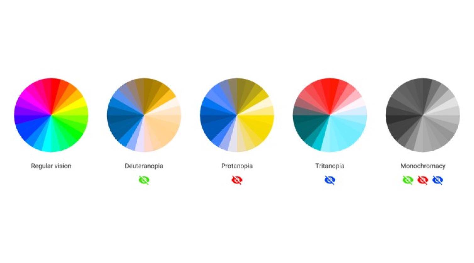
Color blindness affects many people, so it's important to design websites that are accessible to everyone. Consider text readability, color filters, color combinations, primary buttons, alert messaging, and graphs.

As designers, we know that color is an essential tool for creating effective and visually appealing websites. But have you ever stopped to consider how your color choices impact users with color blindness?
What Is Color Blindness?
Color blindness affects approximately 1 in 12 men and 1 in 200 women worldwide. It's a condition that makes it difficult or impossible to distinguish between certain colors. For example, someone with red-green color blindness may have trouble telling the difference between red and green.
Text Readability
When designing for color-blind users, it's important to consider text readability. Avoid using color alone to convey important information, and instead use contrast and texture to make text stand out. Use large, bold fonts and avoid using light colors on light backgrounds or dark colors on dark backgrounds.
Color Filters, Pickers And Swatches
Color filters, pickers, and swatches are powerful tools that can help color-blind users navigate your website. By providing options for adjusting color contrast and saturation, you can ensure that your website is accessible to all users.
Color Combinations
Choosing the right color combinations is essential for effective design. For color-blind users, it's important to avoid using colors that are difficult to distinguish, such as red and green. Instead, opt for high-contrast colors like black and white or blue and yellow.
Primary Buttons
Primary buttons are an essential part of any website, but they can be difficult to see for color-blind users. To make sure your buttons are visible and accessible, use high-contrast colors and add texture or borders to make them stand out.
Alert Messaging
Alert messages are critical for conveying important information to users, but they can be easily overlooked by color-blind users. To make sure your alerts are visible and easy to understand, use contrasting colors and add icons or symbols to convey meaning.
Graphs
Graphs are an effective way to display data, but they can be difficult for color-blind users to read. To make sure your graphs are accessible, use high-contrast colors and add texture or patterns to distinguish between different data points.
Designing for color-blind users isn't just about making your website accessible to a specific group of people. It's about creating a better user experience for everyone. By embracing the principles of accessible design, we can create websites that are easy to use and understand for all users.
